Skip to main content
Understanding The Big Picture

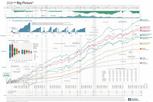
Since COVID-19 came into the picture, there have been many lessons and how it plays role in today's markets. This chart basically demonstrates if you hold the investment long enough, how much a compound effect it can make over the long run. The red line shows how the Canadian economy from 1934 until now, and the turquoise one is in the US. If you follow through the chart, it will show different sections where there has been a drop in the market due to changes in the economy, either a mortgage rate crash, or a recession. In short, it can demonstrate over the long term, that if you were to just leave your investment in the market blindly, your return would still average around 6 ~ 8% over the long term. This can also explain if you just stay in the game long enough your money will definitely grow. On the left-hand side, you can find a small chart, which explains how the market has been doing since the last couple of centuries, and it shows you there have been more up's(Bull market runs) then downs(Bear markets heading towards recession) in the market, so investing works definitely for those that have a long term mentality.
Comments
Post a Comment